Communicating data clearly and effectively can sometimes be more difficult than it seems. It seems easy enough. Just take your results, put them in a graph and hey presto! However, poor data communication is a common issue across industries, even among those with the best intentions. From cluttered graphs and messy charts to unclear tables and confusing metrics, it can sometimes be harder than you think to demonstrate successes and results. To address this, it’s important not to just display data but to convey a message with it. It’s not the data itself that captures attention and drives decisions—it’s the way it is presented and contextualized. This is where storytelling with data comes into play.
Data visualisation is the bridge between raw data and actionable insights. It transforms complex numbers and statistics into clear, compelling visuals that convey a narrative. A well-designed chart, graph, or dashboard doesn’t just present data; it tells a story that engages your audience, emphasises key points, and motivates action.
Why Visualisation Matters
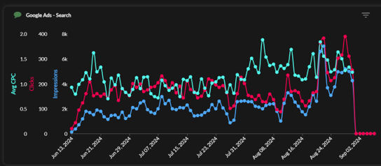
Take the example below. The chart lacks a clear title, consistent scale and uses marketing terminology that may not be familiar to some people. Will your Directors know or care what Avg CPC means? At a glance, it doesn’t tell you much, and if you’re already struggling to get buy-in from senior staff or demonstrate the success of a marketing campaign, this visual probably isn’t going to engage them or make it immediately obvious what you’re trying to convey.
Humans are visual creatures; our brains process visual information tens of thousands of times faster than text. A compelling chart or graph can communicate trends, patterns, or outliers more effectively than rows of numbers or paragraphs of explanation ever could. Here are some key strategies to ensure your visualisations support your story:
Design with the audience’s end-goal in mind.
When shifting between exploring data and explaining data, ask yourself; what are we trying to convey in the first place? What do we want to learn? Asking yourself these questions will help you think how to most effectively communicate them. In the example below, showing gender identity within a company to demonstrate how well women are represented in senior positions, the table contains the data but does not show anything obvious at a glance. The alternative pictograph immediately communicate what percentage of the total number of roles are held by women across four levels of seniority.
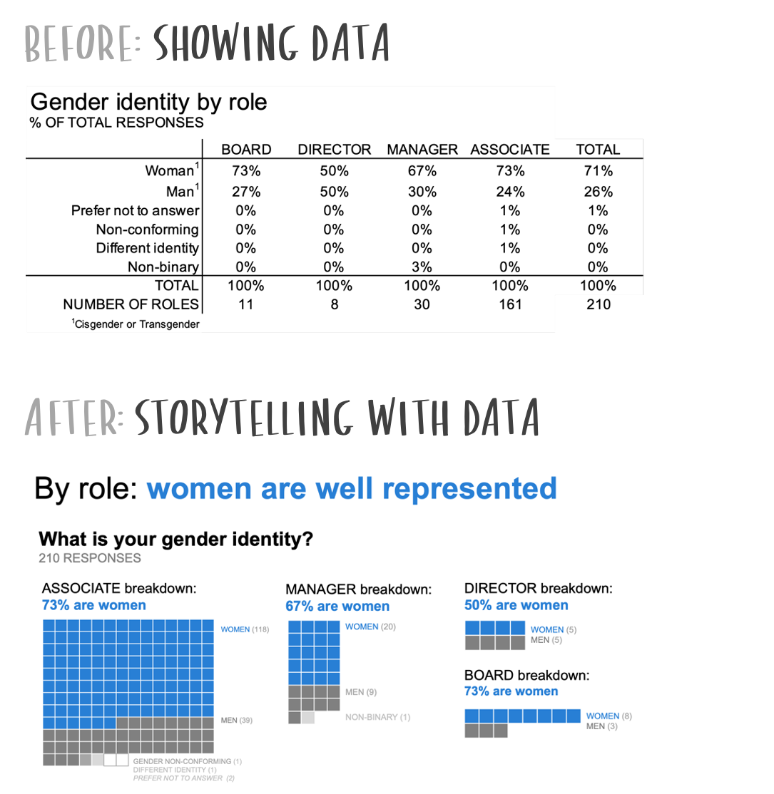
Visuals from Storytelling with Data: A Data Visualization Guide for Business Professionals by Cole Nussbaumer Knaflic
Connect the dots for the audience
When showing what could be viewed as disparate data—but isn't—design thoughtfully so your audience doesn’t have to work hard to understand what your charts are showing. In this competitive analysis example, choosing more effective visuals, active titling and using colour strategically made the associations between the different parts of the data and story more apparent.
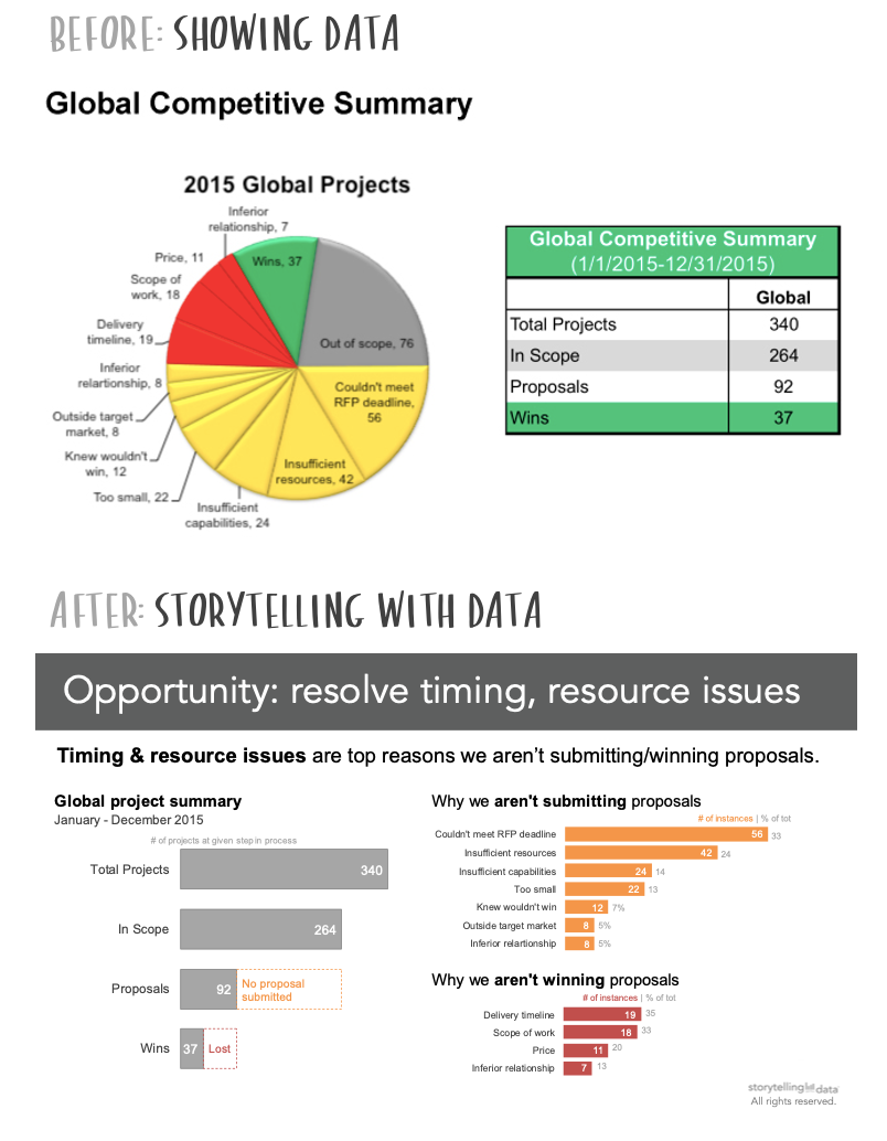
Visuals from Storytelling with Data: A Data Visualization Guide for Business Professionals by Cole Nussbaumer Knaflic
Emphasise Key Insights
Not all data is equally important. Identify the insights that are most relevant to your narrative and make them stand out. Use colour, size, or annotations to draw attention to critical points.
For example, let’s say you have a number of store or office locations and you want to demonstrate which are performing best in terms of sales or new business. A line chart will show this information, but as you can see below it quickly becomes cluttered and hard to interpret. Even having the average in black bold doesn’t do much to make it stand out. An alternative is to present the line chart with a heavy focus on the main takeaway – how overall sales are performing month on month – with a secondary bar chart to demonstrate how each location is performing in terms of sales.
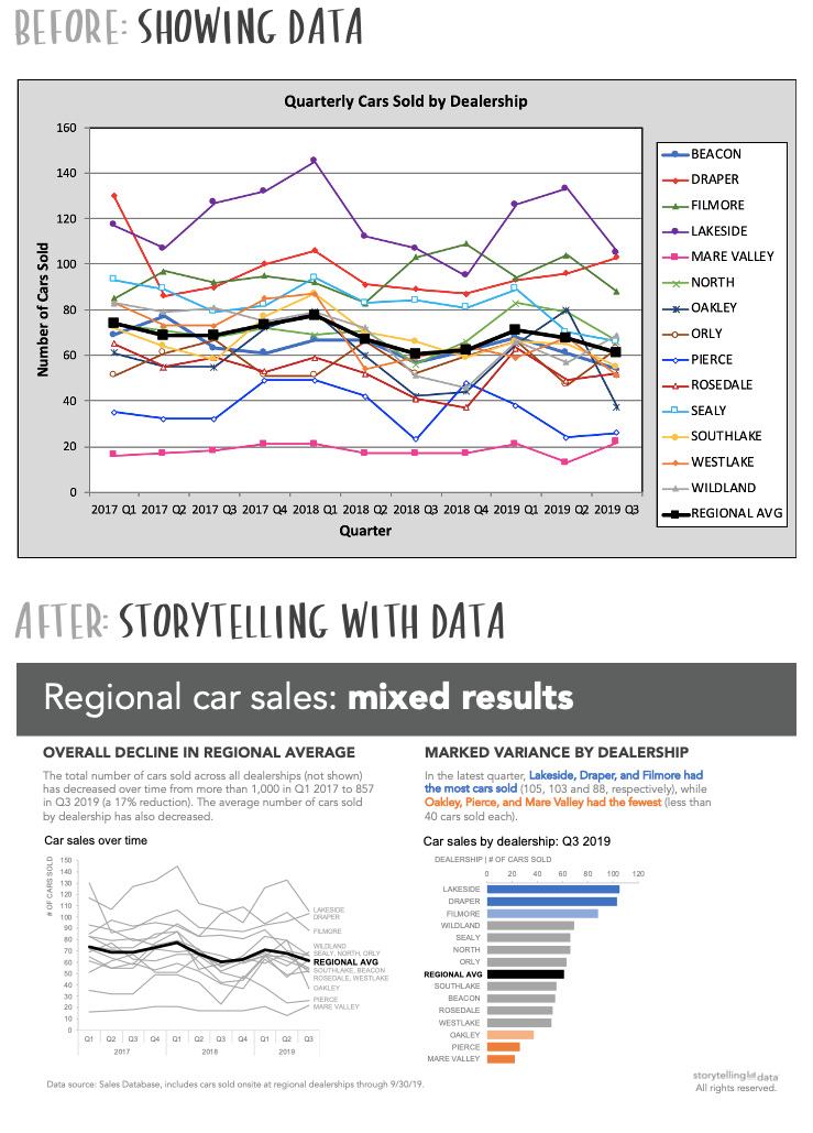
Visuals from Storytelling with Data: A Data Visualization Guide for Business Professionals by Cole Nussbaumer Knaflic
Know Your Audience
Understanding your audience is critical. Are you speaking to executives who need a high-level overview, or data analysts who thrive on granular details? Stakeholders’ familiarity with the data, their priorities, and their preferred level of detail should guide your visualisation choices. Simplify where necessary, but don’t oversimplify to the point of losing nuance.
Storytelling Drives Buy-In
When presenting to key stakeholders, storytelling with data is your most powerful tool for gaining buy-in. A strong narrative not only makes your findings more engaging but also helps build a shared understanding of the implications. Stakeholders are more likely to trust your insights and act on your recommendations when they can see and understand the story the data tells.
Storytelling with data is more than a skill; it’s essential in today’s data-driven world. By combining the power of visualisation with a compelling narrative, you can transform raw numbers into a tool for influence, alignment, and action. Whether you’re pitching a new idea, presenting results, or identifying opportunities, remember it’s not just about showing the data - it’s about telling the story.
Get in touch to find out more about how we can help your business make the most of its data insights with custom reporting and training.
1st Floor, Alphin Brook House,
Alphin Brook Road,
Exeter EX2 8RG
MORE THAN
Digital
Marketing.
View our sustainability page.
PPC for B2B
PPC for Law Firms
PPC for Luxury Ecommerce Brands
PPC for Travel and Tourism
GEO Audit